
Dashboard Widgets
Vincent Depassier · September 1, 2026
There are 25 widget types. This page is the catalogue, and the advice that matters is which family to reach for.
Charts
Widget | Shows |
Bar Chart | Vertical bars |
Line Chart | A line with points |
Area Chart | A trend as filled area |
Pie Chart | Proportions of a whole |
Radar Chart | Several dimensions at once |
Radial Chart | Progress around an arc |
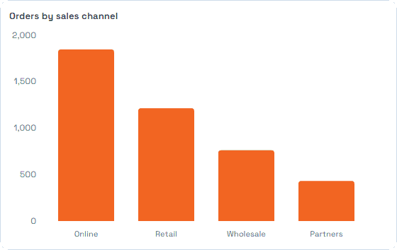
Bar for comparing categories:
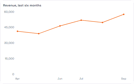
Line for change over time:
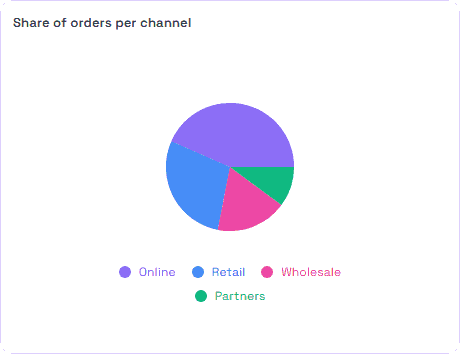
Pie only when the parts genuinely make a whole and there are few of them:
Radar earns its place when you are comparing the same handful of measures across a few subjects, and is unreadable past that.
Single figures
Widget | Shows |
Value | One aggregated number |
LED Indicator | A status light driven by a condition on a table |
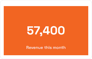
A Value is the widget most dashboards need more of and use least. One number, large, is a better answer to "are we on track" than a chart somebody has to interpret.
The LED is the same idea reduced further: a condition over your data, rendered as a light. Good for the top of an operations board, where the point is to notice when something changes rather than to read a figure.
Working views
Widget | Shows |
Table | Rows, with filters |
Kanban Board | Cards in columns by status |
Gantt | Tasks and a timeline, with dependencies and critical path |
Roadmap | Horizontal lanes, or a progress stepper |
Calendar | Events from a table, in a month view |
Map | Markers from a Geo Point column |
Record Panel | One record at a time, with navigation |
These are the widgets people actually work in rather than look at. Kanban needs a Status column, Map needs a Geo Point column, Calendar and Gantt need dates — the widget is only offered what your table can support, which is a good reason to get the column types right first.
Interactive
Widget | Does |
Filter | A live control other widgets respond to |
Automation Button | Runs an automation on click |
Form | Embeds a form, so people can add data from the dashboard |
The Filter is the widget that changes how a dashboard is used. One filter control, and a single page serves every region, client or period instead of needing a copy per case.
The Automation Button and the embedded Form are what turn a dashboard from a report into a console: see the problem, and fix it without leaving the page.
Structural
Widget | Shows |
Text | A markdown block for titles, notes, instructions |
Image | An uploaded image or logo |
Website | An external page, embedded |
Rich Text Preview | Content rendered as text, markdown or HTML |
Code Editor | A code editor with syntax highlighting |
User Time | Time by user |
Placeholder | A deliberate blank, while building |
Use Text far more than feels necessary. A dashboard that says what it is for, and what a reader should do about a red number, survives its author leaving.
The trap
Every widget is a query. Twenty widgets on one page is twenty reads each time somebody opens it, and a dashboard that loads slowly is a dashboard nobody keeps open.
If a page is sluggish, the cause is usually one of three things: too many widgets, a table widget pulling far more rows than anyone reads, or several widgets computing the same aggregate separately. Cutting widgets is almost always the cheapest fix, and it usually improves the dashboard as a document too.
Next
Dashboards in Praxsuite
Platform Metrics
Sharing a Dashboard
Datatypes in Praxsuite
Create your First Automation