
Platform Metrics
Vincent Depassier · September 1, 2026
Most widgets read one of your tables. A chart or a Value widget can instead read a platform metric — something Praxsuite already measures about your workspace, with no table of yours involved.
Use them to build an operations dashboard for the workspace itself: is the API busy, are automations failing, are end users signing up.
What is available
API Gateway
Metric | Answers |
API calls | How much traffic the gateway is taking |
Calls by type | Which kind of call dominates |
Calls by credential | Which integration is responsible |
Response time | How fast it is answering |
Error rate | How often it is not |
Webhooks
Metric | Answers |
Webhooks | Inbound webhook volume |
Webhooks by receiver | Which endpoint is receiving them |
End users
Metric | Answers |
Registrations | How many signed up |
Logins | How many came back |
Count | How many exist |
Automations
Metric | Answers |
Executions | How often automations ran |
Credits | What they consumed |
How to use them
Point a chart or Value widget at a platform metric instead of a table, and configure it as you would any other: pick the period, the grouping, the aggregation.
The two that belong on almost every workspace's operations board are error rate and calls by credential. Together they answer the two questions you will actually be asked in an incident: is it broken, and who is doing it.
Automation credits deserves a Value widget somewhere visible. Consumption is the thing people notice only once it is a bill.
The traps
These measure the workspace, not your business. End-user registrations counts sign-ups to your app; it does not count the rows in your Customers table, and the two will not agree. Pick the one that matches the question and do not mix them on the same chart.
Calls by credential names the credential, not the person. If several integrations share one key, they are one line. That is a good reason to give every integration its own credential — a shared key makes this metric almost useless exactly when you need it.
A missing metric is not a zero. A quiet period and a period where nothing was recorded look the same on a chart. Before concluding that traffic stopped, check that it was ever arriving.
Next
Dashboards in Praxsuite
Dashboard Widgets
Usage & Quotas
Logs
Credentials and Principals
What it looks like
A widget reading a system metric looks like any other chart — the difference is upstream, in what you had to configure to get here. There is no table and no column mapping: you pick the metric and the interval, and the metric supplies its own axes.
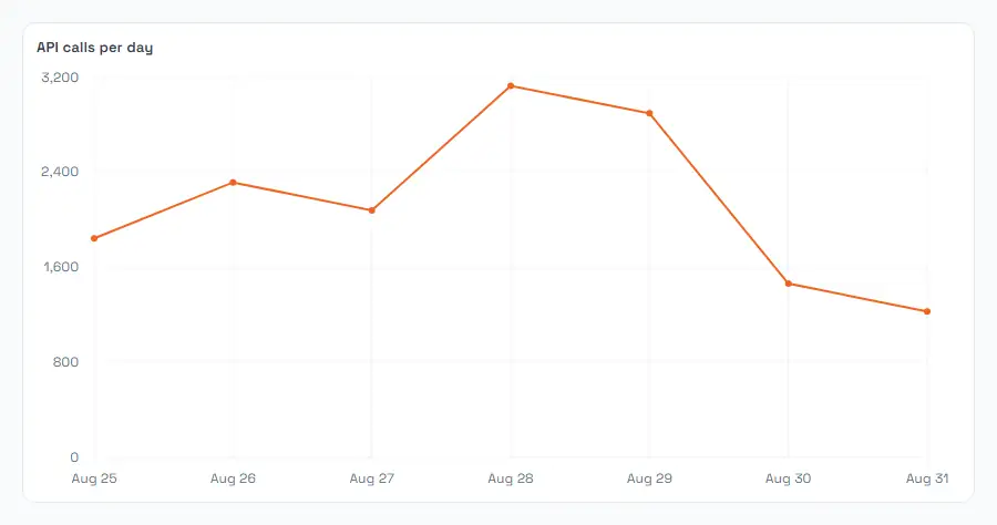
The axis labels come from the metric itself, which is why they read the same for everyone rather than following your column names.